Creating a fully customizable content management platform for onboarding
Project Overview
At Haufe Group, I led the design of a CMS tool to help HR teams efficiently manage and deliver onboarding materials across multiple brands.
The existing process was fragmented, time-consuming, and lacked consistency leading to duplicated efforts, outdated documents, and confusion for new hires. I collaborated with stakeholders across HR, product, and internal communications to design a scalable, structured solution.
The result was a modular system that saved time, improved alignment, and supported a more consistent and engaging employee experience.

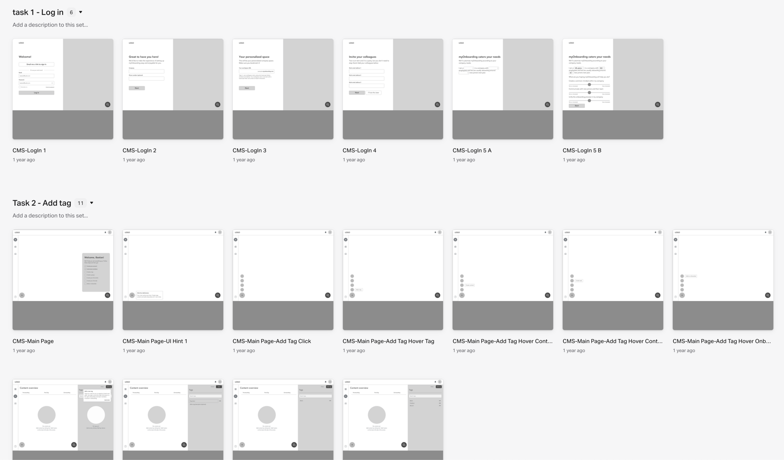
Detail of a design showing the CMS onboarding journey builder.
Impact summary
Increased content update efficiency by introducing a scalable CMS system.
Reduced operational overhead by centralizing fragmented onboarding content across multiple stakeholders and touchpoints.
Accelerated content delivery by replacing manual processes with templates and CMS logic, reducing setup time from weeks to days.
Led a cross-functional discovery process, aligning product marketing, HR, and product stakeholders on shared onboarding objectives.
Framed and facilitated workshops to define taxonomy, user flows, and governance rules for long-term CMS maintainability.
Client
Haufe group
Duration
4 months
Methods
Journey mapping, user interviews, workshops, prototyping, usability testing, visual appeal test
My role
Product Designer and User Researcher
Team
Product owner, Engineering Lead, 3 Engineers, 1 Product analyst, 2 Product Designers, cross-department stakeholders
The design steps
Getting the context
Understand current user journey experience. Identify challenges for users and establish opportunities for experimentation.
Framing
Prioritise and ideate on major pain points for users and the service. De-risk opportunities and set the hypothesis for the prototype exploration.
Exploration
Sketch alternative journeys, test prototypes, iterate on findings and refine touchpoints.
Delivery
Consolidate findings into most reliable first delivery candidate. Work closely with engineering and data science to refine prototype. Create the design system. Evaluate with users.
Getting the context - Journey mapping, User interviews, Stakeholder interviews
To get the context about the project and the business goals, I set up stakeholder interviews with the PO, Tech Lead, Sales and Marketing teams to understand how the product is positioned in the market, what are customers saying, what are the technical goals and difficulties at the moment etc. I wanted to know where could research and design bring the most value up front.
Learnings:
The engineers were unsure of the value of features as all requests were coming in from the sales team. They needed me to provide a more analytical approach to the roadmap and bring them closer to user needs.
The PO wished I would help bridge the communication between the development team and the business side through expertise on customer needs and an approach to experimentation and ideation.
The sales team did not trust the team would ‘build the right thing’ so most of my efforts in the beginning were to gain trust and I did so by creating an experimentation mindset with clear measures of success for short term trials.
Next I set up user interview calls to get to know our customers, their behaviours, needs, frustrations and goals. For this purpose I conducted a set of research activities:
Contextual inquiries with 5 customers and 3 in-company HR admins who were using our product with the goal of drafting a persona and the jobs to be done related to onboarding. The final artefacts took the shape of empathy maps and the persona profile of our HR admin (see below).
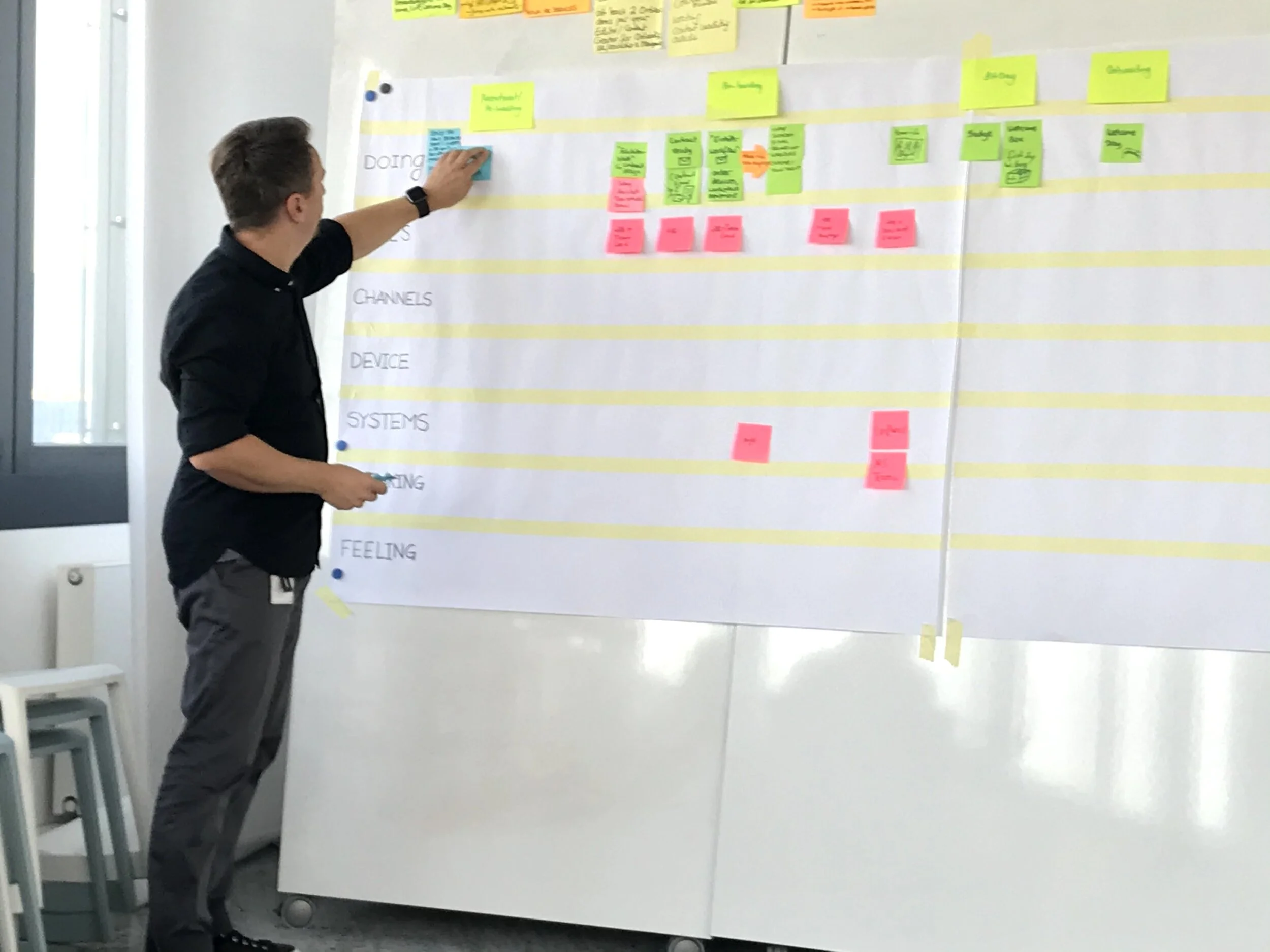
Journey mapping workshop with stakeholders and onboarding experts at the company with the goal of mapping out the journey of onboarding our customers go through and showcasing high and low points in the experience. This led to more in depth analysing and prototyping in later stages.

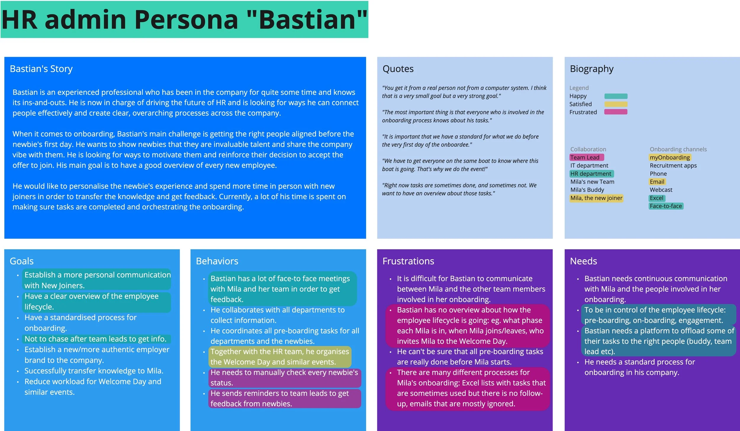
Empathy map and persona definition for Bastian, the HR admin tasked with creating onboarding journeys,
To understand the steps in the onboarding process, I conducted a journey mapping session.
The aim of the journey mapping session was to align stakeholders on the steps in the experience of setting up an onboarding journey and to identify where the experience can be improved. I mapped out the roles involved in creating an onboarding journey, the mediums they currently use and how they feel in each step. We took an educated guess about the onboardee feelings which I later validated through research.
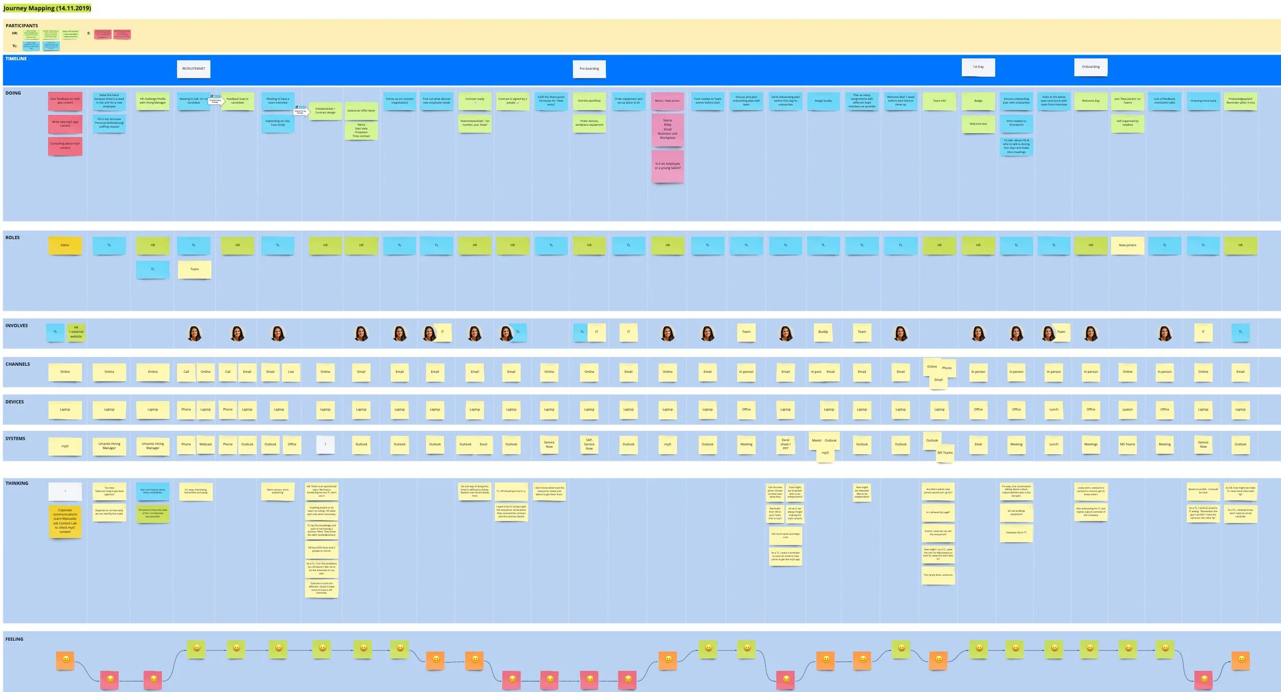
Journey mapping session for an onboarding process.
Discoveries
Users were lacking a reliable way to define re-usable onboarding experiences. It should be easy to maintain, give a quick overview of where each onboardee is in the process and act as a source of truth and one stop place for the onboardee experience.
Onboarding processes happen across a variety of mediums (email, phone calls, Whatsapp etc) which is very tiring to keep track of.
Users have a variety of tasks in their day-to-day job. Current onboarding setups mean they need to manually check on a variety of topics like onboarding status, onboardee questions etc which could potentially be automated.
Establishing a personal communication with onboardees is crucial to how the latter experience the company culture.
The types of information shared varies from articles and surveys to tasks and documents.
Framing - Establishing pain points and opportunities
Together with the team, I framed the problems we would like to focus on first, based on the main persona needs and frustrations and low experience points in the journey maps.
Decisions
Giving Bastian, the HR admin persona, the control over the onboarding experience is crucial. We needed to explore ways of achieving this.
Not each onboarding journey is the same so Bastian needs to have various templates ready for catering to the right experience.
Automate anything we can. Notify for important steps. Don’t expect Bastian to be on the platform at all times.
Focus on creating an easy, customizable, automated, clear product for creating onboarding journeys.
Exploration - Ideation on HMW, Flowchart, Prototype, Testing
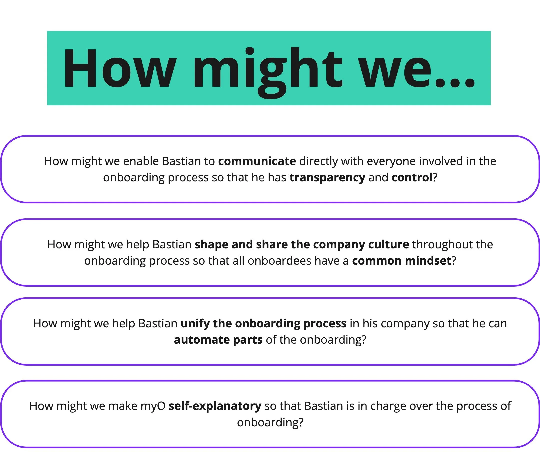
Once we framed the main problems we wanted to solve, I organized an ideation workshop with the team in order to explore the many options we have for solving these problems.
The results were used as explorative features and improvements and were added into the low fidelity prototype for testing.

Ideation workshop on the main HMW statements.

This flowchart served as the basis for the first low fidelity prototype that we then took back to our customers and tested its usability.
3 rounds
I facilitated 3 rounds of usability testing, from low to high fidelity.
4+
After each testing session I would iterate on the prototype.
Desirability toolkit
At the end of the usability tests I ran an additional Microsoft desirability toolkit test to better craft the visual design experience.
Hypothesis:
Different industries will need different started packs.
Re-usable content created through tags will help Bastian keep the onboarding experience in check.
Using journey templates makes Bastian’s job easier.
Discoveries
Users did not find the initial industry survey useful for personalising their experience. They mention preferring to have more templates available to choose from instead.
The tagging system was well received: “I like being able to find everything related to a topic easily.“
Templates were well received as well: “It makes the process so much faster than today!“
Other insights
Users needed to co-create journeys and make sure they are not stepping on each other’s toes.
Users needed to preview what the journey experience would look like in the app screen: Do pictures fit well? Is there too much text? etc.
The overall overview of the onboarding process can be too overwhelming so I needed to explore different options.
Low-fidelity prototype used in usability test.
I continued with a high-fidelity prototype iterating on the feedback received in the first round of testing. Once I was happy with the result, I reached back out to users to see if the main issue were now solved.


Sample screens of the refined onboarding application: (Left-right): Journey builder, Onboardee profile, Create a new journey from template.
The feedback was positive and the team and I were confident we can start developing the product.
Delivery - Design system, Visual appeal test
After the usability test rounds, I organized an interface inventory workshop. Together with the whole team, I cut the interface into small parts and we decided how to split it into components.
We used Storybook for the component library and Frontify for documentation.


Interface inventory workshop which set the basis for our design system.
Next I wanted to work on the visual design of the application. I tested some options based on the Haufe group branding guidelines using the Microsoft desirability toolkit: offering positive, negative and neutral words that customers had to correlate with the two options. The goal was to see which of the two options is associated with the words we want to transmit through our brand and product. I also collaborated with the marketing team to work on these words.
We tested with 10 HR admins from different industries. Here are the options and the results:

Light version vs Dark version of the CMS app.


The dark version was preferred.
In general, the darker version was considered more professional, personal and appropriate while the light version was associated with boredom and rigidity.
Some elements of the lighter version made the experience feel more fresh and inviting so I refined the dark prototype to lighten it up a bit in an effort to achieve a good compromise.
Applying visual design to our product
After the visual desirability test I proceeded to work on the perceptual patterns of our design system:
Color palette
Typographic scales
Space and grid definition
Elevations and shadows
Later on I added more definitions. Please see a video below walking you through the design system.

Conclusion and present state
What is worth mentioning separately is that I applied a similar approach to defining the onboarding mobile app which you can see here.
Increased content update efficiency by introducing a scalable CMS system.
Reduced operational overhead by centralizing fragmented onboarding content across multiple stakeholders and touchpoints.
Accelerated content delivery by replacing manual processes with templates and CMS logic, reducing setup time from weeks to days.
We had an increase in sales with the release of the version I helped define and build.
Customer feedback was significantly improved measured through qualitative interviews.
What I would have done differently
Release sooner
This project was my first leadership project where I was leading all stages of the design process from research phase to final specs for the developers. Needless to say I was a bit worried to fail, so I erred on the safe side by testing many times in prototype phase. With more experience now I would be able to run faster and with more confidence through some of the testing phases in order to release and learn then iterate.
Run more experiments
This application was quite the challenge to take on for a small team. I wish I had run a few more experiments before moving on. We had a plethora of ideas that never saw the light of day. However this project taught me to make very strict trade-offs and rely on data as well as experience and gut feeling which I mix with continuous iteration.
